Response 10 - Folding Back The Years
Dear Marie,
I enjoyed doing Task 10. It allowed me to indulge my taste for minimalism and abstraction—and finally to make an object I actually (or almost) like. Here’s that object, made in response to your instructions. Below, I try to justify why and how this is a response to the task you set!
In the task you talk about time, a theme of the past few tasks. And so it is here: the click track marks the seconds, and most of the elements of this film are either a second in duration or a whole multiple thereof. But of course you had in mind something less literal than this: the ‘folding time’ of reenactment. You asked me to recreate a visual art piece I made in my past, and I have done so—it’s just that I haven’t mimicked the look or outward form of the piece, I have mimicked instead its generative rules (again, it’s parametric work…). I didn’t have a copy, or rather an iteration, of the reference piece (one or more A3 sheets somewhere in Leeds). Note that I can’t speak of an ‘original’ because it was a screenprint, produced in a small series of ten or so. So you see, time here emerges as a kind of fold within folds! I did track down a .doc file with some designs for the screenprint. Here’s one version, though not exactly what I decided to make a print of, I think (the print I made was in black, white and shades of grey).
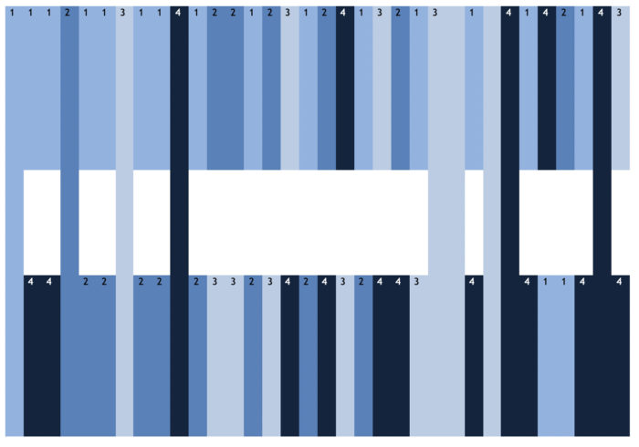
The image on the screenprint was meant to be generated according to a simple number progression, with a colour or tint corresponding to each number, and each colour-number had to be placed in combination with every other number, or something like that. The long vertical stripes were generated when a colour-number in the top and bottom strips corresponded. I liked the idea that a viewer would be able to reconstruct by deduction the principles behind the picture. (Note that the identifying digits in the design above were omitted in the printed versions.) For my response to your task, I decided to take the idea of the colour-number progression and combination and adapt it for a film, as the medium I’m currently trying to learn. To reenact within my now, so to speak. I thought about a few formats and have finally borrowed one from the artist Josef Albers, from his famous series known as Homage to the Square. This format allowed me to combine all of my four colour-numbers in every permutation. It also allowed me to use a very unusual 1:1 aspect ratio (which is maybe lost when watched fullscreen, sadly).
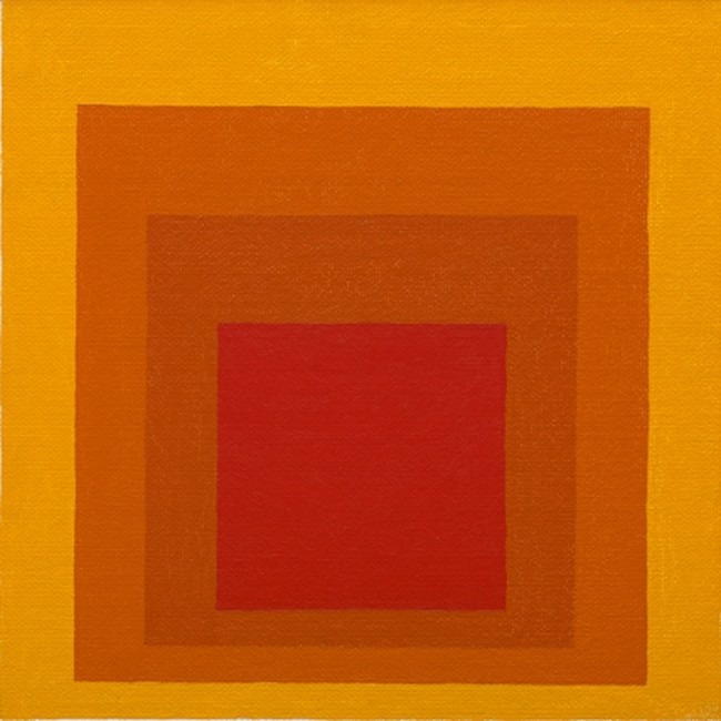
Joself Albers, Study for 'Homage to the Square: Closing' (1964)
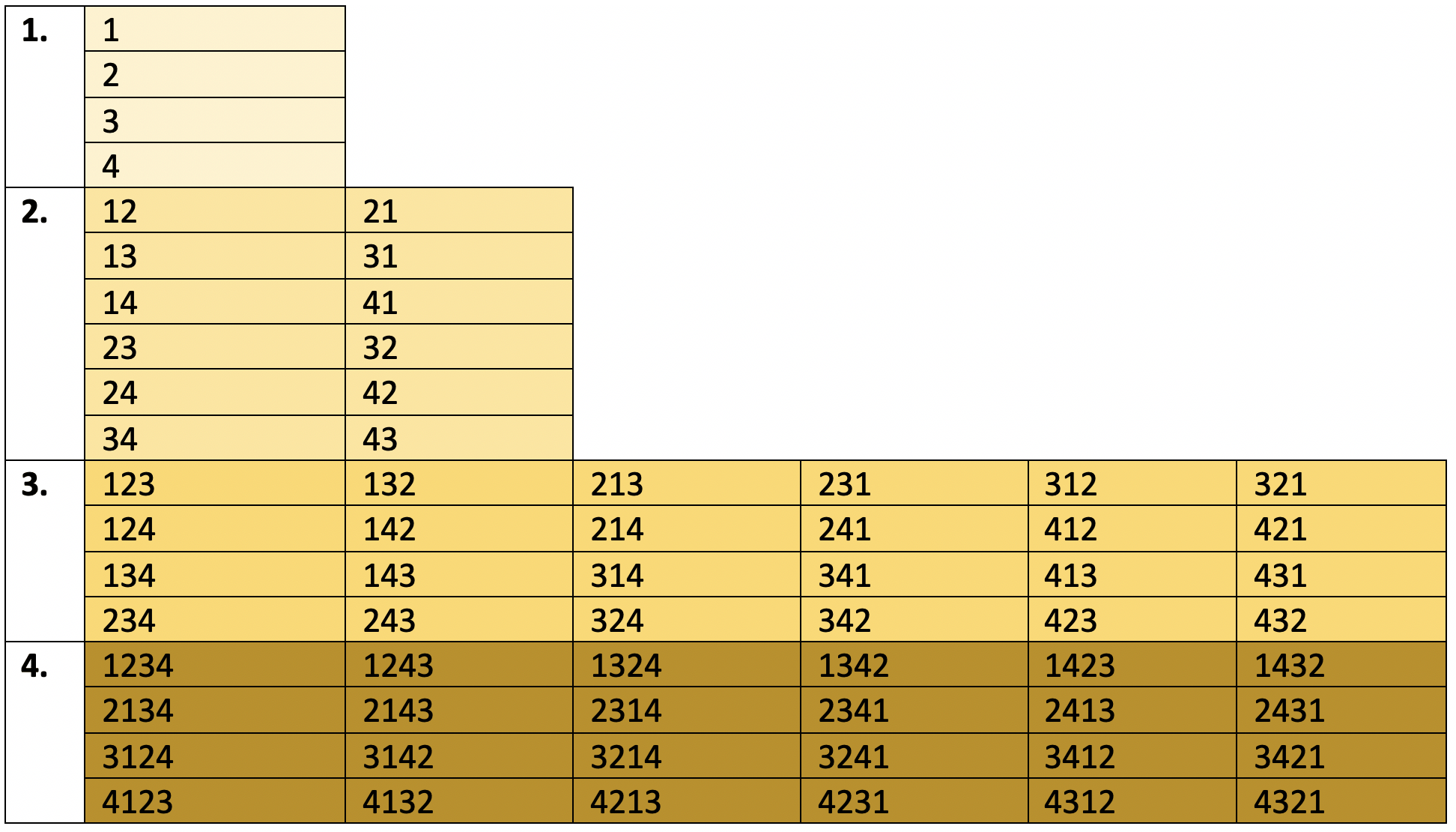
I remember when I was working on the design for the screenprint that I found it hard to decide on the colours. I couldn’t settle on an arbitrary way of choosing them; I thought about the primary colours, but that didn’t appeal. My editing software, Premiere Pro, solved this for me. The colour spectrum it has (and maybe this is a digital standard) identifies hundreds (thousands?) of individual colours by a six-digit number, sequence of letters or number/letter combination. I decided to go for shades of grey and use those shades that correspond to the following numbers, given here from lightest to darkest (the single figure in brackets is the number in my progression): 888888(1); 666666(2); 444444(3); 222222(1). I kept white (ffffff) and black (000000) for the titles. Here’s the number progression I arrived at, which I think covers every permutation/combination of numbers 1-4, divided into four sections in the film. This progression is what the film, I suppose you could say, ‘illustrates’, but also what generates it. Content and structure are the same thing in this film, you see!