Response 42 - Studies for a Self-portrait
Dear Marie,
I’ve never been a fan of Francis Bacon. That’s not to say that I don’t feel the power of his work, but I can find it facile and macho. Bacon has sometimes been opposed to David Hockney, and I’ve always preferred the latter. I like how Hockney engages with contemporary technologies—the fax, the photocopy machine, the iPad—and I like the absence in his work of banal pronouncements on the tragedy of the human condition. Hockney is a hedonist, whereas Bacon (a famous boozer) seems a self-medicator, and Bacon was invariably hero to the fucking painters in my art college, always male, always at themselves illustrating their tedious fucking despair.
I remember feeling vindicated when I came across the essay by John Berger in which the great writer on art expresses similar feelings about Bacon’s work. He says Bacon is a painter of mindlessness with nothing in common, say, with the questioning attitude of the existentialists; for Berger, ‘Bacon questions nothing, unravels nothing. He accepts the worst has happened.’ Berger finishes his essay in rhetorical fashion with a notorious and sniffy comparison between Bacon and Disney:
Bacon’s art is, in effect, conformist. It is not with Goya or the early Eisenstein that he should be compared, but with Walt Disney. Both men make propositions about the alienated behaviour of our societies; and both, in a different way, persuade the viewer to accept what is. Disney makes alienated behaviour look funny and sentimental and therefore, acceptable. Bacon interprets such behaviour in terms of the worst possible having already happened, and so proposes that both refusal and hope are pointless. The surprising formal similarities of their work—the way limbs are distorted, the overall shapes of bodies, the relation of figures to background and to one another, the use of neat tailor’s clothes, the gesture of hands, the range of colours used—are the result of both men having complementary attitudes to the same crisis.
The comparison is ‘sniffy’ because it’s clear that Berger sees Disney stylization as merely a commercial technique designed for easy consumption. Bacon too, Berger is saying, is despair-lite, a caricatural shorthand for the alienation of our modernity, with no interest in the political means to overcome it. Bacon is capital’s house painter, making beauty from the despair capital generates and calling it the human condition:
it becomes clear that you can live with the worst, that you can go on painting it again and again, that you can turn it onto more and more elegant art, that you can put velvet and gold frames round it, that other people will buy it to hang on the wall of the rooms where they eat.
Whatever you think of Berger’s opinion, and he later backtracked a little, the comparison with Disney was surely inaccurate: Bacon was closer to Tex Avery than to Disney. And what Berger says about the Bacon and the distortion of the body, the relationship of figures and background, and the treatment of colour seems to me truer of Tex Avery’s grotesques than Disney (though perhaps Tex Avery’s comic nihilism has a satirical tinge absent in Disney and Bacon).

Tex Avery's Baconesque distortions
I dwell on these stale thoughts because of your comments about how you were fascinated by Francis Bacon’s ‘use of colours and shapes and representation of the body’. You say you felt ‘they illustrate[d] how I experience my own body at the moment’, meaning your experience of pregnancy. A comment like this, from someone I love and respect, must make me reconsider my irritation with Bacon’s work, and urges me to recognise its capacity to speak to others, even to offer them resources to make sense of their own situation.
For that reason, in performing my task, I have played it ‘straight’, avoiding irony. You asked me to use Bacon’s technique and style to make sense of the experience of my aging body, and to confront aspects of my body that feel ‘other’ or different from how I perceive myself. In using digital tech to make my images, as I describe below, it is true that I have maintained my essential fidelity to David Hockney. Bacon would never have sacrificed the riskiness of painting (he worked on unprimed canvas so errors couldn’t be wiped away) for the easy correctablility of the digital. But I have mimicked him sincerely in my fashion.
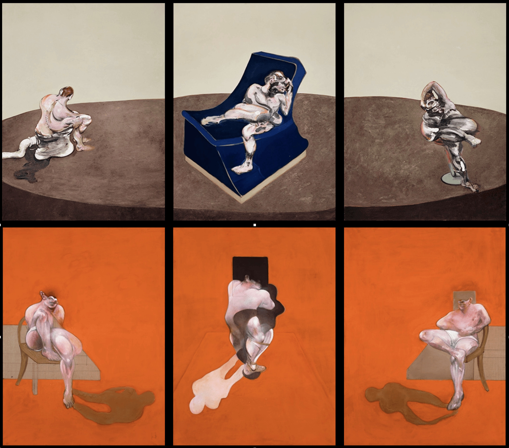
Here are a couple of Bacon’s paintings that I looked at. (They're obviously magnificent, and I paused before including them, thereby implying some flattering relationship with my own work, here.)
I also glanced at film work that I knew referred to Bacon’s style. One obvious point of reference was Love is the Devil (1998), a biopic about Bacon and his unequal relationship with his lover George Dyer.
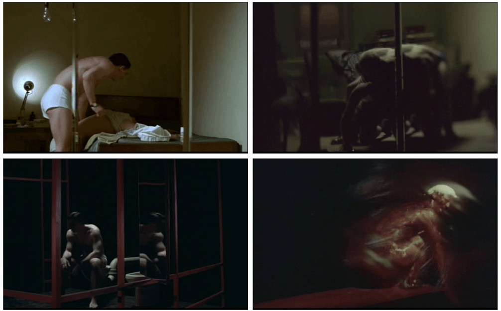
Bacon-style compositions in Love is the Devil
More interesting for me, though, was the video for the REM song ‘Lotus’ (also from 1998), directed by Stéphane Sednaoui. It’s a good simple song, I think, but it’s a wonderful video, which works out what Bacon’s typical motifs can be on film in a more persuasive way than Love is the Devil’s residual kitchen sink palette and mood. I like the use of sparkles to approximate Bacon’s intentional/accidental splashes of paint, for example. Of course, if there is a savvy commercial appeal in Bacon’s stylish despair, Lotus has that to the nth degree: this is an ad for a rock band after all, and whereas Bacon’s figures are contorted with the grief of living, the boys from REM look carefully cool. As Michael Stipe claims: ‘I look very, very foxy in this video […]; it shows off my incredible stomach muscles.’
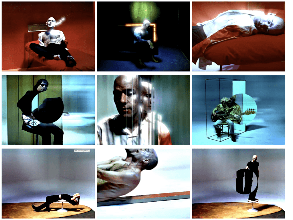
REM do Francis Bacon in the video for Lotus
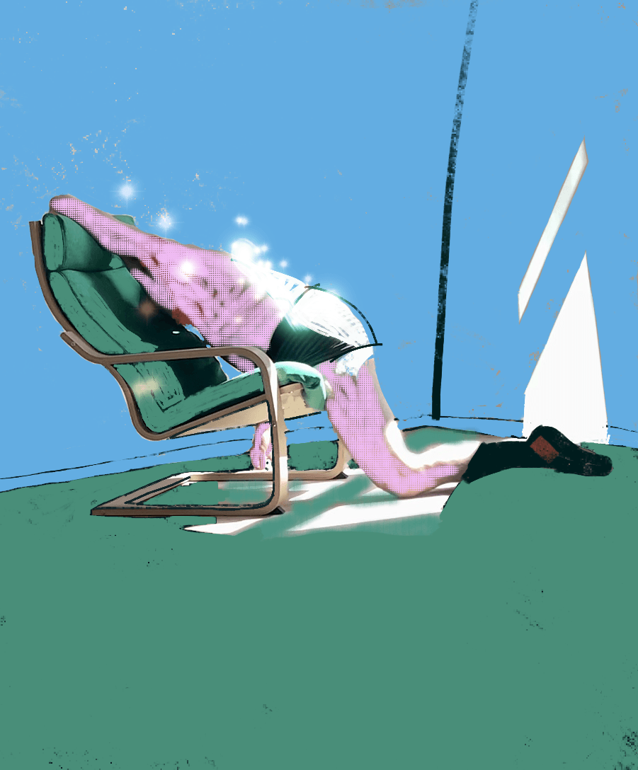
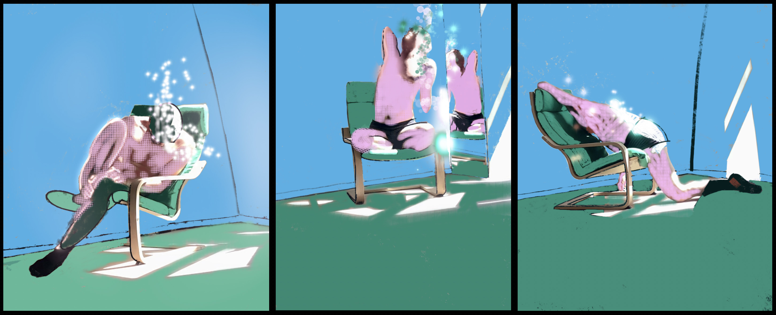
If there is one persistent theme in this project, it revolves around my attempt to get you to think in formal terms, and yours to get me to take my clothes off. This task forced me to confront the reality of my aging body in a way that (I realised) I have developed strategies to avoid. I stripped to my old boxers and socks, and filmed myself posing abjectly on our Ikea chair. Reader, I no longer have Michael Stipe’s admirable muscle tone. There, in all its alcohol-worn facticity was a wrinkled belly protruding over the band of my shorts. There was an ass heading south. Cellulite thighs. The skin as an organ giving up the last ghost of elasticity, collected in humiliating folds over my kneecaps.
As I have done in several previous responses, I ran the horrible film through VLC to get it to spit out frame grabs every X frames (in this case, every ten), and I chose some of these generated images for a pair of triptychs, a set of ‘studies for a self-portrait’, in the Bacon manner. First I tried out some images that had been pixelated in some sort of app glitch. I thought these glitch images might work as an analogy for Bacon’s deliberate cultivation of the accident in his painting. Here they are, in a first triptych produced on my iPad using Instagram filters and then overpainting using the Procreate illustration app.
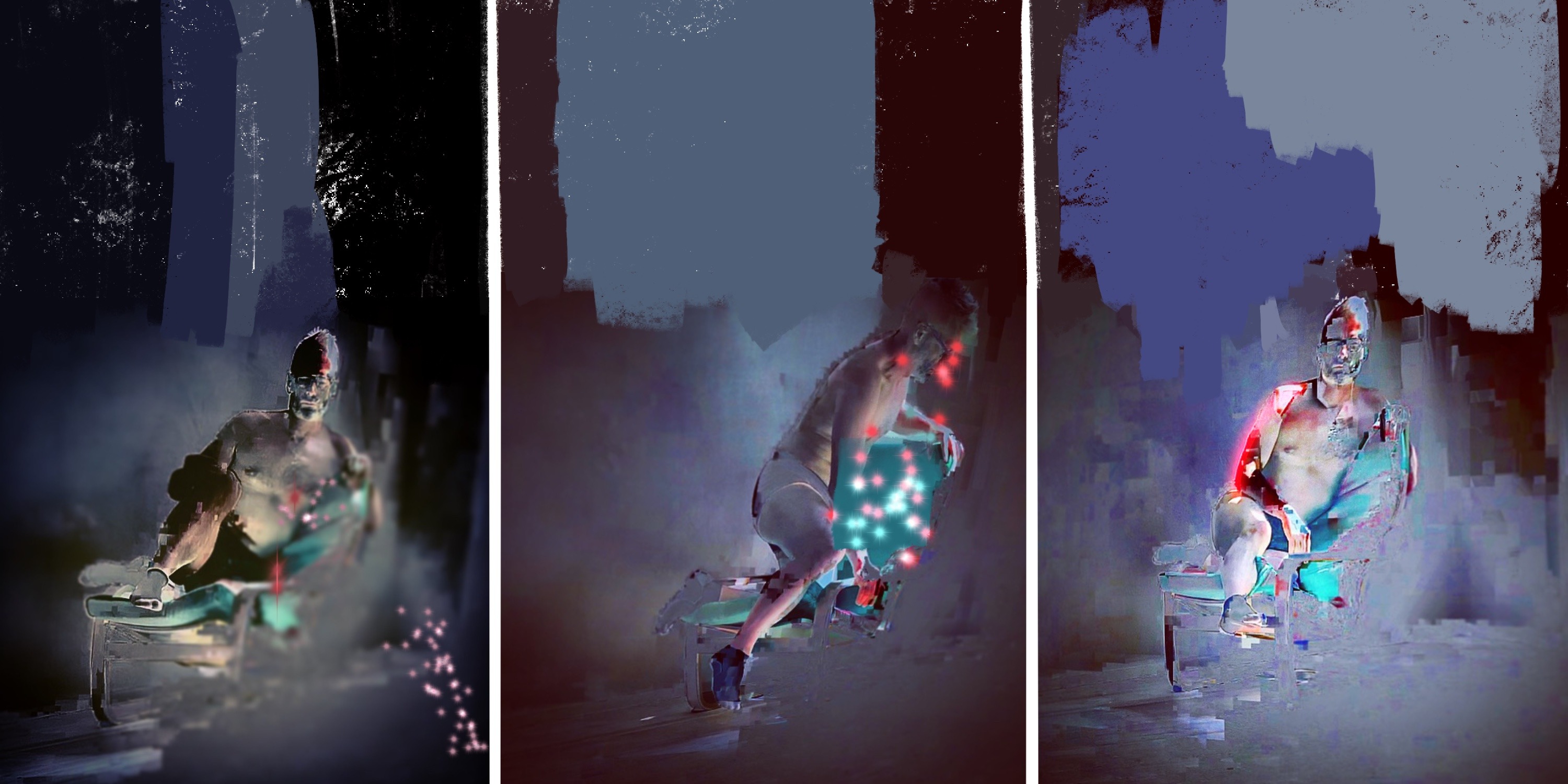
The result of the glitch images didn’t satisfy me because it’s too far away from Bacon, who uses frank, flat colours and theatrical backgrounds. So, in a second attempt, I let the bubble-gum green of the Ikea chair guide my colour scheme, to take me closer at least to Tex Avery territory. I liked and retained the angular shapes created by the sunlight through a triangular window in our living room, even if Bacon was not at all interested in light. (His paintings contain stylized shadows, but always seem to depict an interior sealed off from daylight. Berger says that, in Bacon’s work, ‘consciousness of time or change does not exist’; daylight implies time and change.) I borrowed the sparkles and luminescence used in the Lotus video, easily made in Procreate. I would have liked to work on the three images further, to eliminate some clumsiness and better to emulate Bacon's compositional style where figures are smaller in their environment and lines are continuous across the panels, but here is the resulting Avery-Baconesque triptych. (Click on the image for a larger version in a new window.)
Have I shown empathy, as you requested I should, with the changes you are experiencing in your body due to pregnancy? Can these aestheticized depictions of abjection help you, as you hoped, to feel less isolated in your pregnant body? I admit that I doubt it. I suspect these triptychs picture regret-that-is-still-a-narcissism rather than any generosity of feeling. Perhaps this is true to Francis Bacon. As John Berger said, Bacon’s figures are distinguished by their ‘total unreceptivity’, their indifference to others. But, Marie, whatever these images might say, believe me that I am not indifferent to you.
Reference
John Berger’s 'Francis Bacon and Walt Disney' was written in the 1960s and has been reprinted in Portraits: John Berger on Artists (Verso Books, 2015)